In a new series of posts, “From Scratch”, I’ll show you how to build simple and complex applications showing all the code and tools used for development. In the first post of the series I will show how to create a login page, using only the basics of HTML and CSS and Javascript.
This will be the first part, where we will define the layout and structure of the page, we will leave Javascript for the second part.
If you want to follow up and be notified, click here and sign up to receive the notifications.
Without further ado, let’s get our hands on it.
Starting from the basics, the structure of any HTML page will be quite similar to this one.
<!DOCTYPE html>
<html lang="en">

<head>
    <meta charset="UTF-8">
    <meta name="viewport" content="width=device-width, initial-scale=1.0">
    <title>Login Page</title>
</head>

  <body>

  </body>

</html>
Some information about this structure.
A tag of type <meta> provides metadata about the HTML document.
<meta charset="UTF-8"> specifies the character encoding for the HTML document.
width=device-width defines that the page width should follow the screen width of the device (which will vary depending on the device).
initial-scale=1.0 sets the initial zoom level when the page is loaded for the first time by the browser.
Right, set the basic structure, let’s start how to start create our login page, now it’s time to start putting the elements on the screen.
It’s only five elements, nothing too complex.
Let’s work with our form first. To help with the structure and appearance of the page, I’ll use Bootstrap 4.4, which is very simple to use and has excellent documentation. To include the bootstrap CSS file in the page, there’s no mystery, just copy and paste the code with the link just below the <meta> tag.
<!DOCTYPE html>
<html lang="en">

<head>
    <meta charset="UTF-8">
    <meta name="viewport" content="width=device-width, initial-scale=1.0">
      <link rel="stylesheet" href="https://stackpath.bootstrapcdn.com/bootstrap/4.4.1/css/bootstrap.min.css">
    <title>Login Page</title>
</head>

  <body>

  </body>

</html>
I want to build the form centralised on the page, and regardless of the size of the screen, I want it to follow the same proportions.
Bootstrap has a lot of useful tools and classes to adjust the responsiveness. Good without wasting time, this is the form code.
<div class="row align-items-center h-100 ">
    <div class="col-8 col-md-3 col-xs-8 mx-auto l-form">
        <form class="form" method="post">
            <img class="row mx-auto" src="https://i.imgur.com/RhJpe7c.png" width="150">
            <div class="form-group ">
                <input type="text" placeholder="Email" class="form-control i-form">
            </div>
            <div class="form-group">
                <input type="password" placeholder="Password" class="form-control i-form">
            </div>
            <div class="form-group">
                <button type="submit" class="btn btn-dark btn-md btn-block">Login</button>
            </div>
        </form>
    </div>
</div>
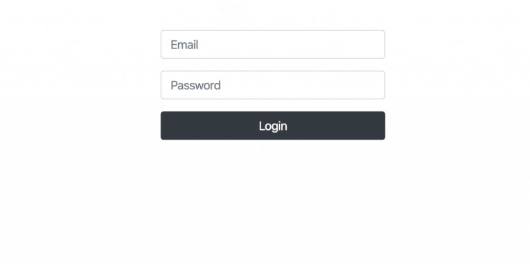
In that code I’ve already put 4 of the elements that we had previously defined. The logo of the page is there, believe me, only it’s white, so it won’t appear until we change the background.
What I’m creating with this code is a structure, using the Bootstrap Grid System, to align our form horizontally and vertically in the center of the screen.
I also used the classes: col-8 col-md-3 col-xs-8 to keep the proportions on different types of canvas.
There are probably several other ways and classes I could use to create the same form with the same characteristics. But this code is meant to be quite simple, we don’t need extremely elaborate solutions yet.
Suggestions are always welcome, leave your comment.
Your page should look like this at the moment.
To improve the overall appearance of the page, I created a very simple CSS file. That specifies the l-form and i-form classes, and some other attributes for the <body> and <html> tags.
body,html{
  height: 100%;
  overflow: hidden;
  background-image: url(https://i.imgur.com/X97iVv1.jpg);
  background-size: cover;
}

.l-form{
  background-color:rgba(39, 41, 45, 0.5);
  border-radius:12px;
  padding: 12px;
}

.i-form{
  border-radius:12px;
  padding: 12px;
}
For the <body> and <html> 5 attributes:
height:100% so we can enjoy the entire usable area of the screen.
overflow: hidden removes the scroll bars from the page.
background-image and background-size defines an image for the background of your page and the behaviour of that image, respectively.
This is our final HTML file, after we put all the pieces together:
<!doctype html>
<html lang="en">

<head>
    <!-- Required meta tags -->
    <meta charset="utf-8">
    <meta name="viewport" content="width=device-width, initial-scale=1">
    <!-- Bootstrap CSS -->
    <link rel="stylesheet" href="https://stackpath.bootstrapcdn.com/bootstrap/4.4.1/css/bootstrap.min.css">
    <link rel="stylesheet" href="../css/login-style.css">
    <title>Login Page</title>
</head>

<body>
  <div class="row align-items-center h-100 ">
      <div class="col-8 col-md-3 col-xs-8 mx-auto l-form">
          <form>
              <img class="row mx-auto" src="https://i.imgur.com/RhJpe7c.png" width="150">
              <div class="form-group">
                  <input type="text" name="email" placeholder="Email" class="form-control i-form">
              </div>
              <div class="form-group">
                  <input type="password" name="password" placeholder="Password" class="form-control i-form">
              </div>
              <div class="form-group">
                  <button type="button" class="btn btn-dark btn-md btn-block">Login</button>
              </div>
          </form>
      </div>
  </div>
</body>

</html>
If you’ve followed everything so far as your login page was taught, it should look like this:
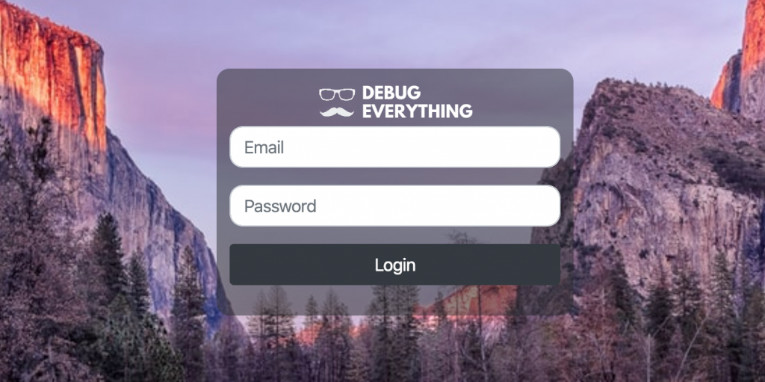
This was a very easy tutorial, but a login page is like the front door, a business card and I believe the first impression is very important.
I hope you enjoyed it. Until part 2.
Leave a Reply